Project summary
A webshop with a Quiz section to help users find their preferred coffee beans easier online
A request came from a cafe owner to realize business goal- increase sales online. It was designated to manage the cafe's official account.
2 main directions which were defined:
- Design webshop look and re-design the branding
- Make it easier for customers to choose coffee beans online
Time frame
March- August, 2022
Client
Local cafe
My role
the only UX designer in this project
Background
During pandemic, people have to order coffee products online instead of trying out coffee in the cafe a few times and then deciding which coffee beans to get from the cafe.
With a Chinese local cafe owner, we initiated this project during Covid lockdowns. We started to move into a mobile first solution on her current web presence- Wechat official account, in the hope of expanding services and increase online sales when there were no on-site sales at all.
Challenge
- Branding is not clear: the official account were meant for a physical store, but now it should give an impression that they can purchase coffee beans
- Users were often at loss when they faced multiple choices of coffee beans in a webshop
- Users were not certain about their preferences in coffee bean flavor
Solution
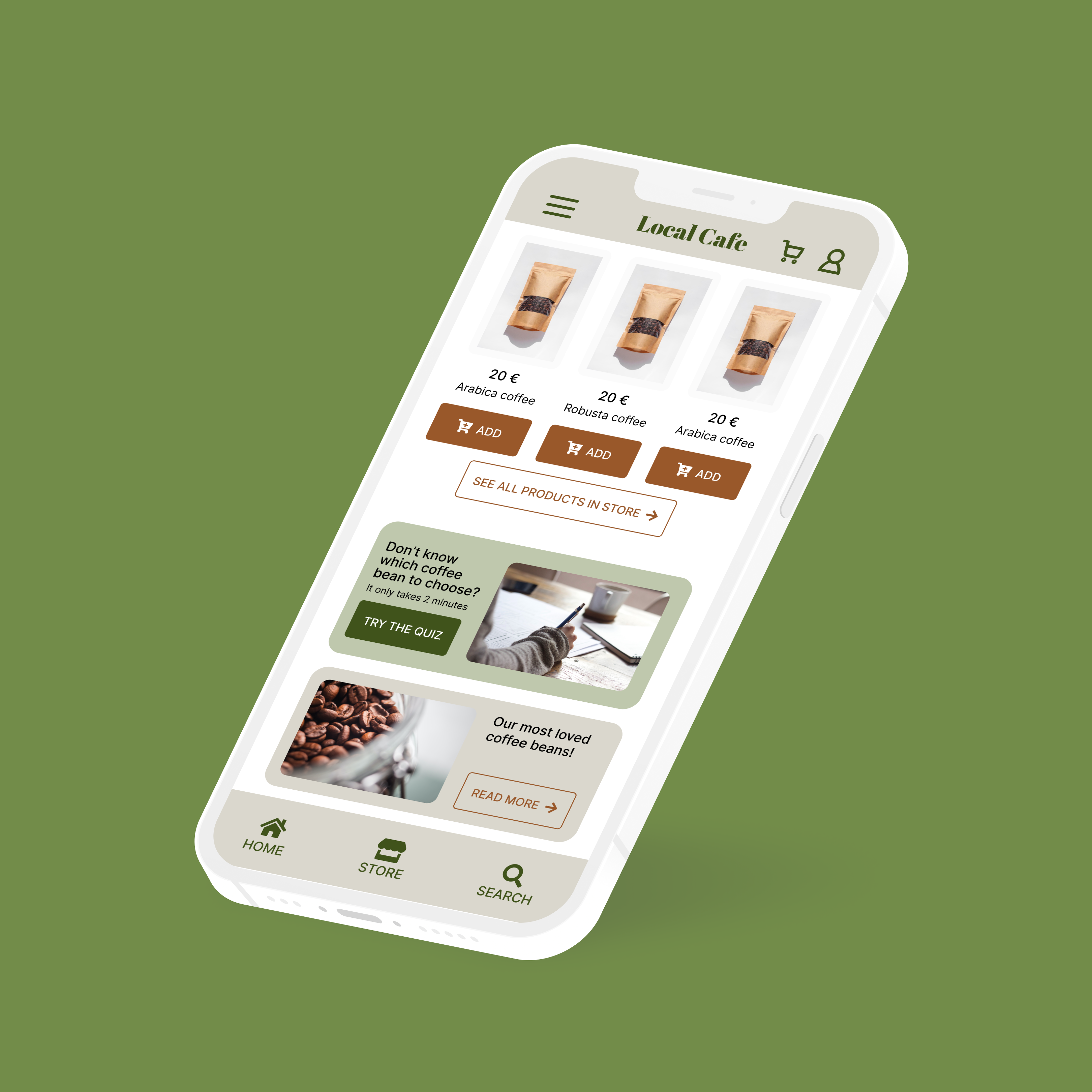
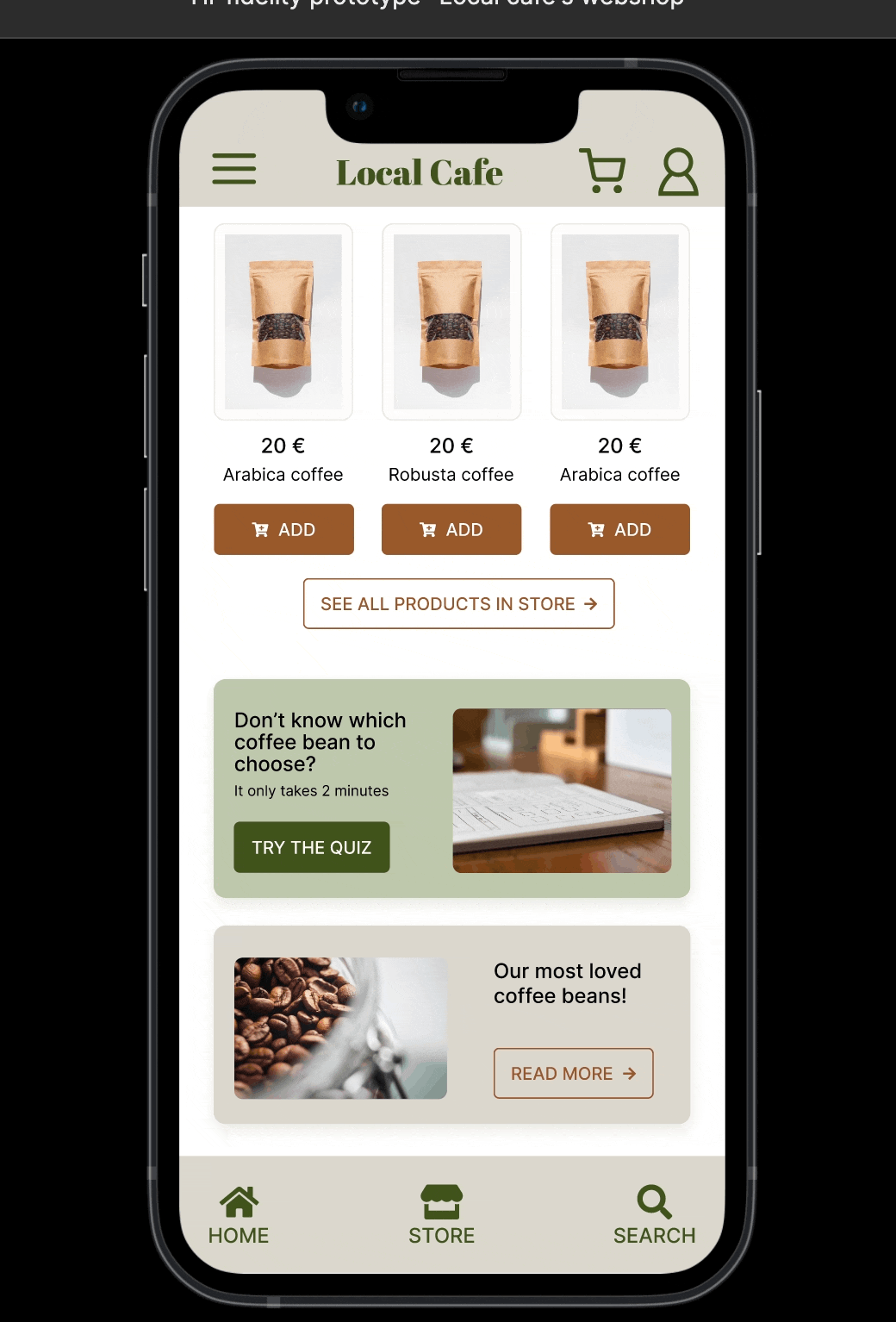
- A refreshed webshop look for their official account
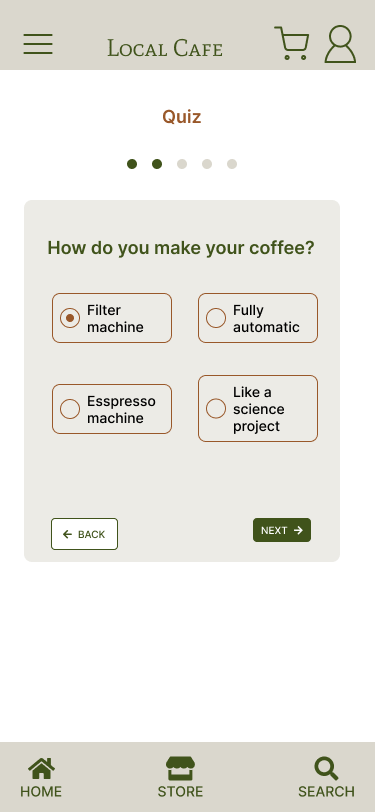
- A new feature Quiz in order to help user find their preferred coffee beans.
A high-fidelity webshop prototype with a full mock-up journey of placing order were designed. A Quiz was there to help users identify their coffee flavor preferences. At the same time, coffee bean recommendations were presented, which were available in the webshop.
Steps in process
Because the project initiated during Covid time, there were a lot of variance of behavior changes from users compared to those before Covid. So we thought it was necessary to take it from ground to build a solid solution.
We both had a good understanding and consensus by using this 5-step UX process.
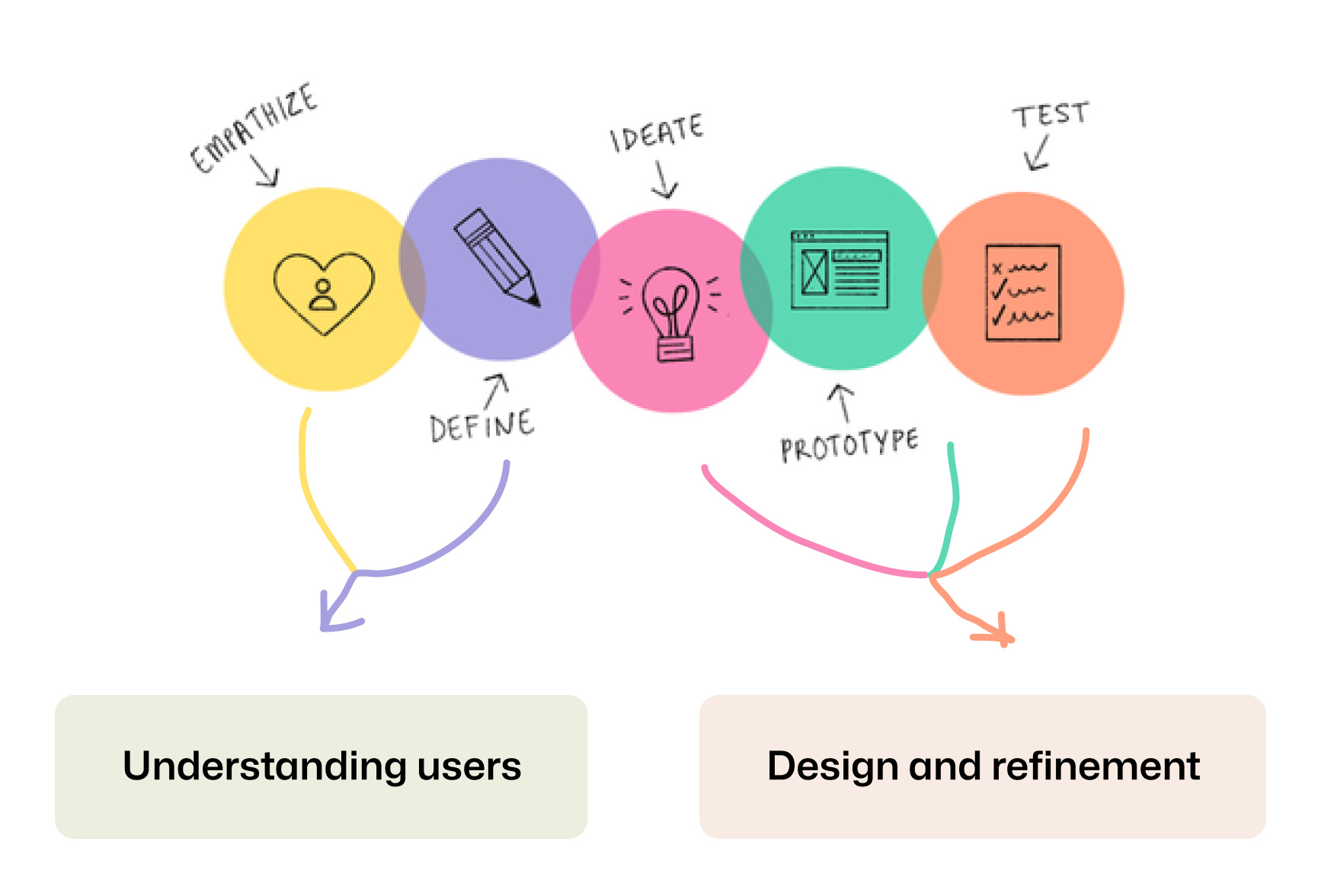
We had adapted these general steps in our process, but grouped them into 2 big sections for milestone checkups.
Understanding users
Our primary targeted user group were identified by client. Ideally, they were those who drinks coffee regularly but are curious to try out new coffee beans. We hand-picked 6 participants to do user interviews.
With the intension of discovering new behavior from users, we carried out a survey with 34 participants in various channels of social media first.
Interview questions:
- What is your coffee rituals?
- Has covid-19 sitution changed your coffee drinking habit? And how?
- Have you ever ordered coffee beans online?
- If yes, what good or bad experience you have had?
- If not, what are other shopping experience you have had that left you some impressions that you would like to express? (for example: grocery shopping, clothing shopping)
Based answers collected from the user interviews, I had sieved data into 2 typical personas.
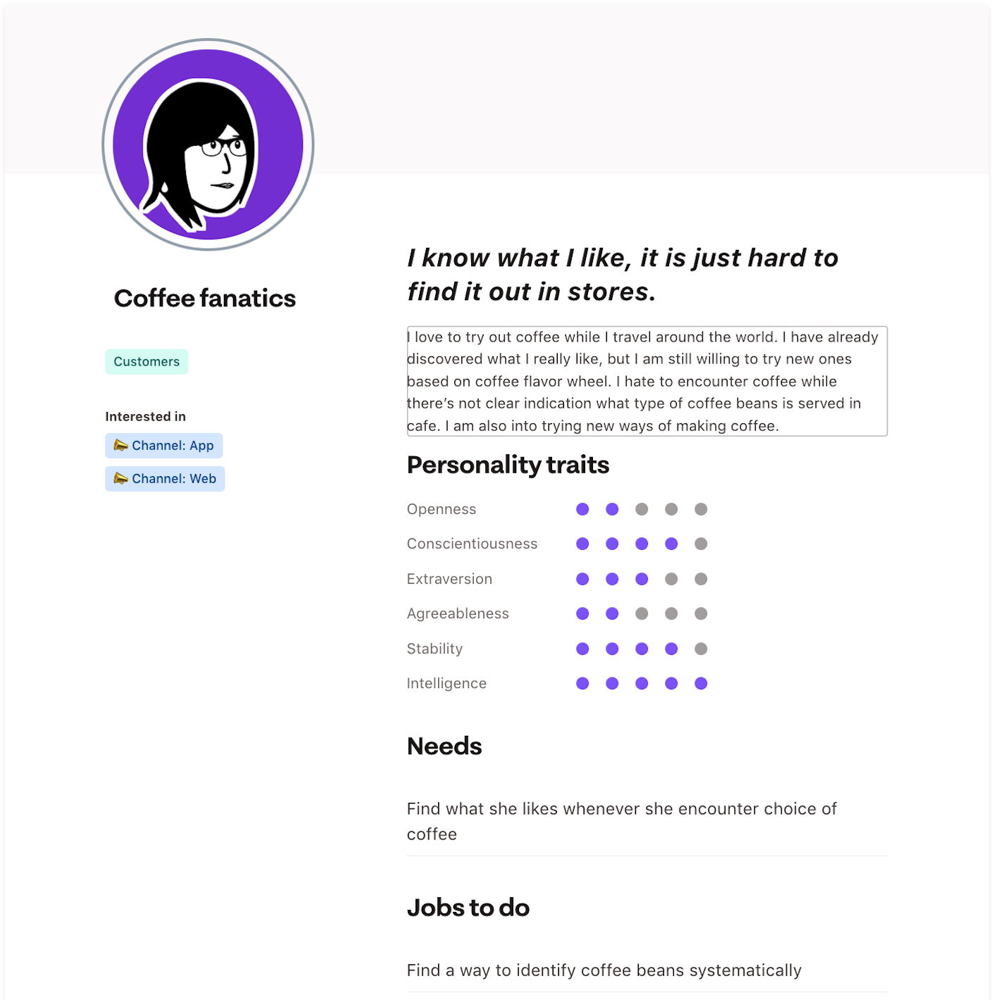
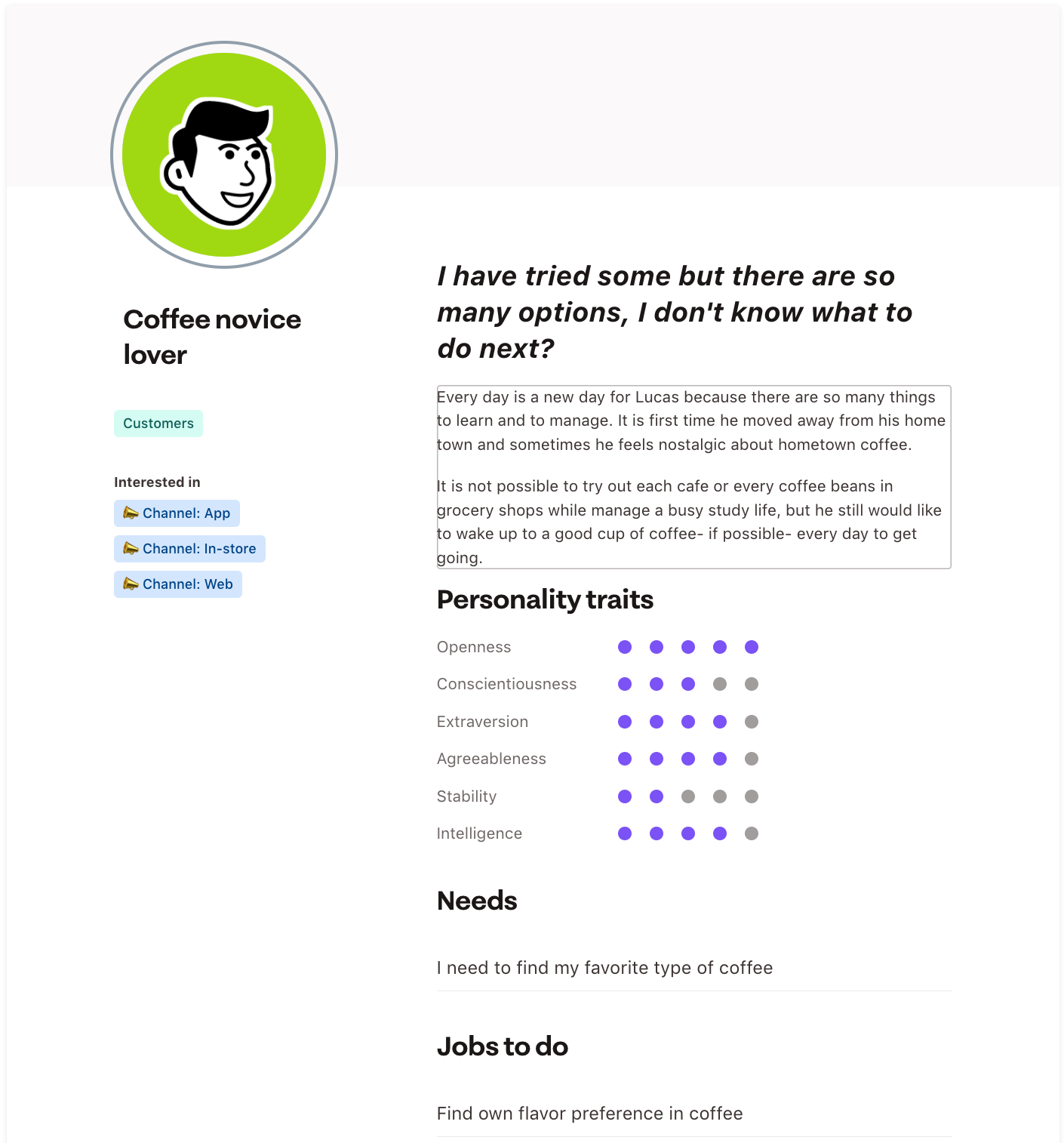
In this user research, we had discovered that users were often at loss when they face multiple choices of coffee beans in a webshop; and it was hard to put their preference towards coffee beans which were in the webshop.
Ideate based on insights
After setting our user persona, and have the pain points in mind, we had done a session of brainstorming and crazy 8.
I wanted to share with business owner a fairy visualized idea how our personas going to act and interact in a real scenario, I decided to use storyboard to represent a user story. I created 2 storyboards to show case this scenario.
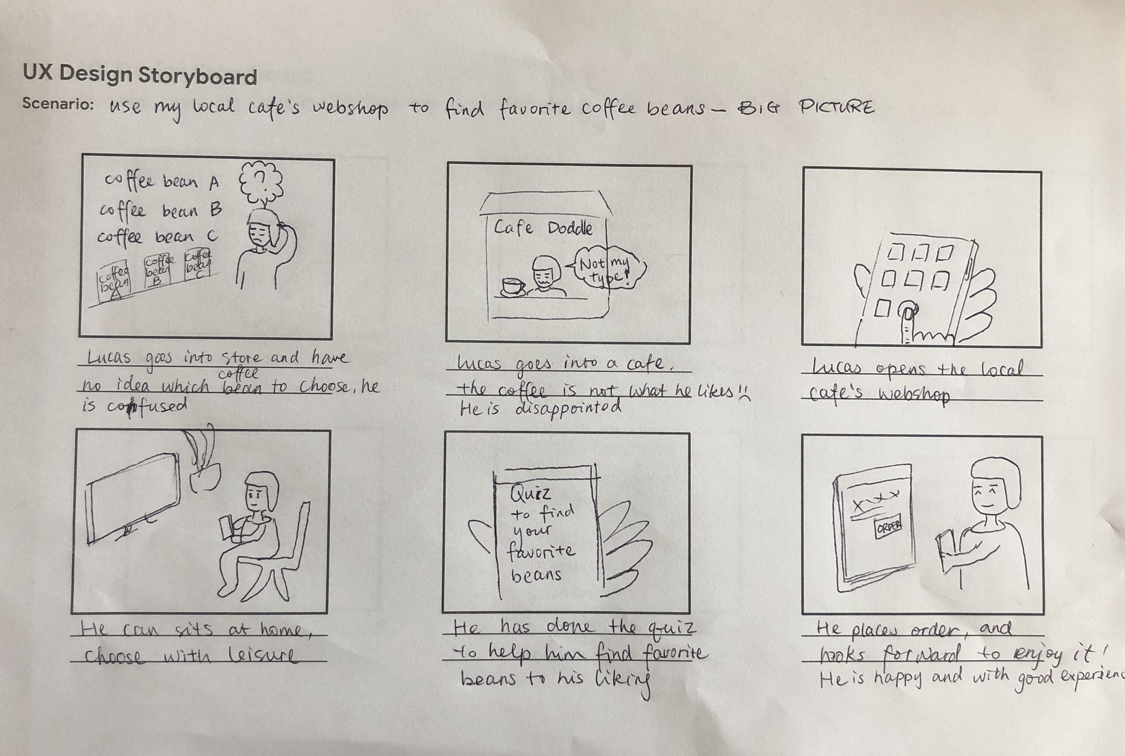
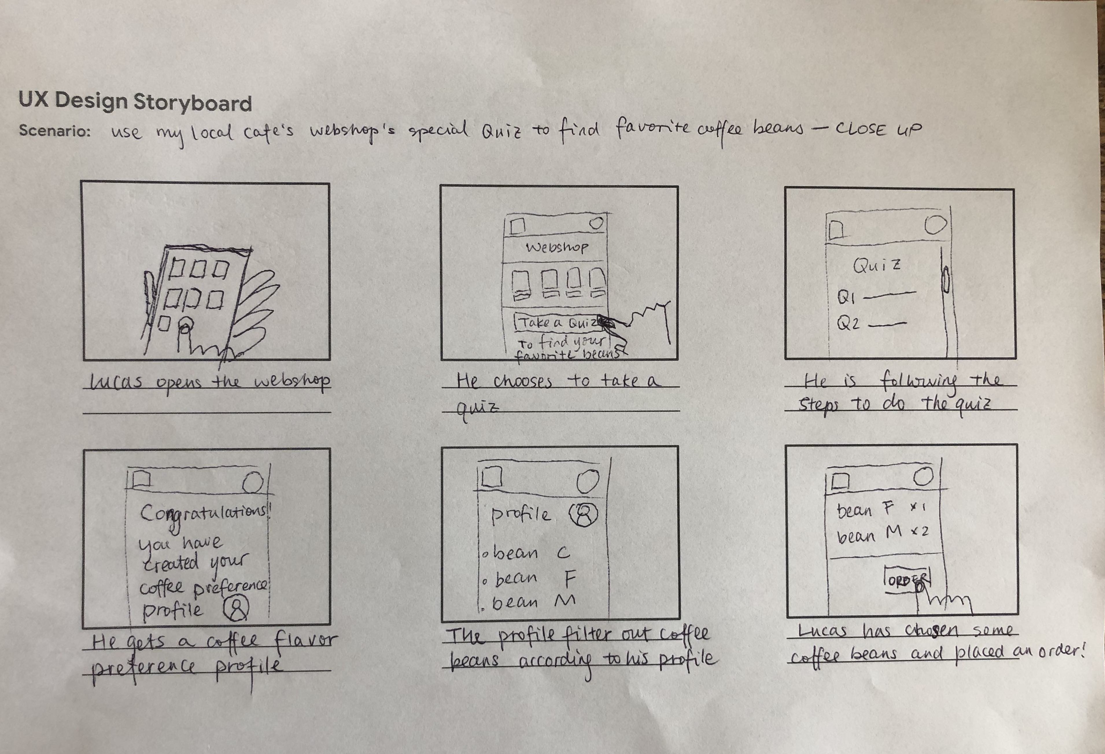
With the aid of storyboards, we had decided to create a section called “Quiz” incorporated in the online webshop. By using the Quiz, users could quickly identify their coffee flavor preference; and at the same time, users could be directed to recommended coffee beans in the webshop, which were found in the result of the Quiz.
Design and refinement
Create a low-fidelity prototype to test basic function
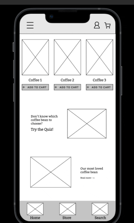
Based on the storyboards, I created low-fidelity wireframe and its prototype.
Conduct usability study on Low-fidelity prototype
A usability research was followed immediate with the purpose of finding flaws quickly, saving time and budget before diving into high-fidelity wireframe creation.
I had based question on System Usability Scale (SUS), time on task and use of navigation these KPIs to measure the usability study.
- Is it easy to place an order in the app?
- How many steps does the user take to find the “Quiz”?
- Is it easy to find the “Quiz”?
- How do you like it when it shows filtered results?
- What is the overall experience with this app?
The usability test had reflected some results as listed below:
- scores 4.5 on SUS of the webshop
- Less than 1 minutes of finishing the order procedure
- Less than 45 seconds in finishing the task of answering the Quiz
- 100% of participants felt it was easy to complete the Quiz
- 67% of users liked the filtered results after the Quiz; 33% of them prefer the result could be reflected in the "Store" page
- 80% of participants have positive experience with the webshop
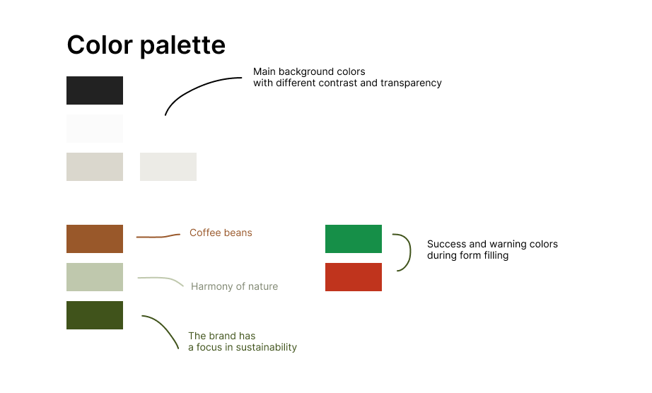
Design brand theme
After first usability research and low-fidelity prototype, we had decided on color themes, fonts and styles of images. We started to make our first draft of high fidelity prototype and followed with a usability study.
Carry out user interview upon high-fidelity prototype
After our usability test's result on low-fidelity prototype and color themes, we designed our first version of high-fidelity prototype.
Because we still wanted to strive for a better user experience, immediately I conducted a user interview with a usability study in it to get feedback. It has been carried out with 6 participants.
I utilized affinity diagrams to collect and sort qualitative data I had collected from this user interview to identify some patterns.
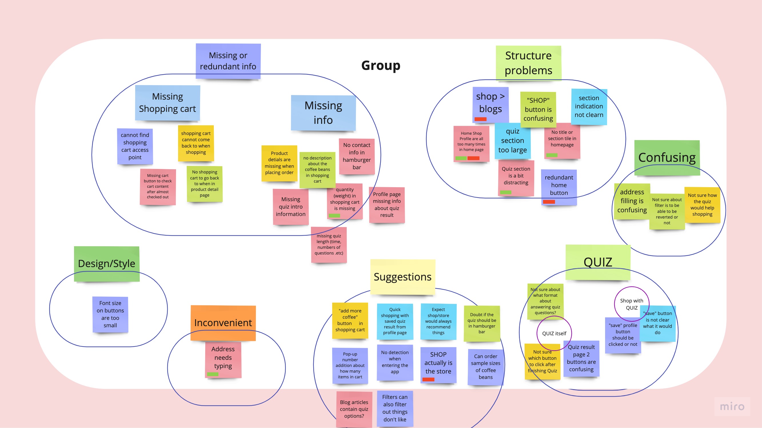
I represented some change I had made based on conclusions distilled from this affinity map.
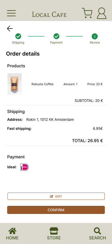
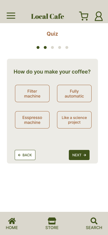
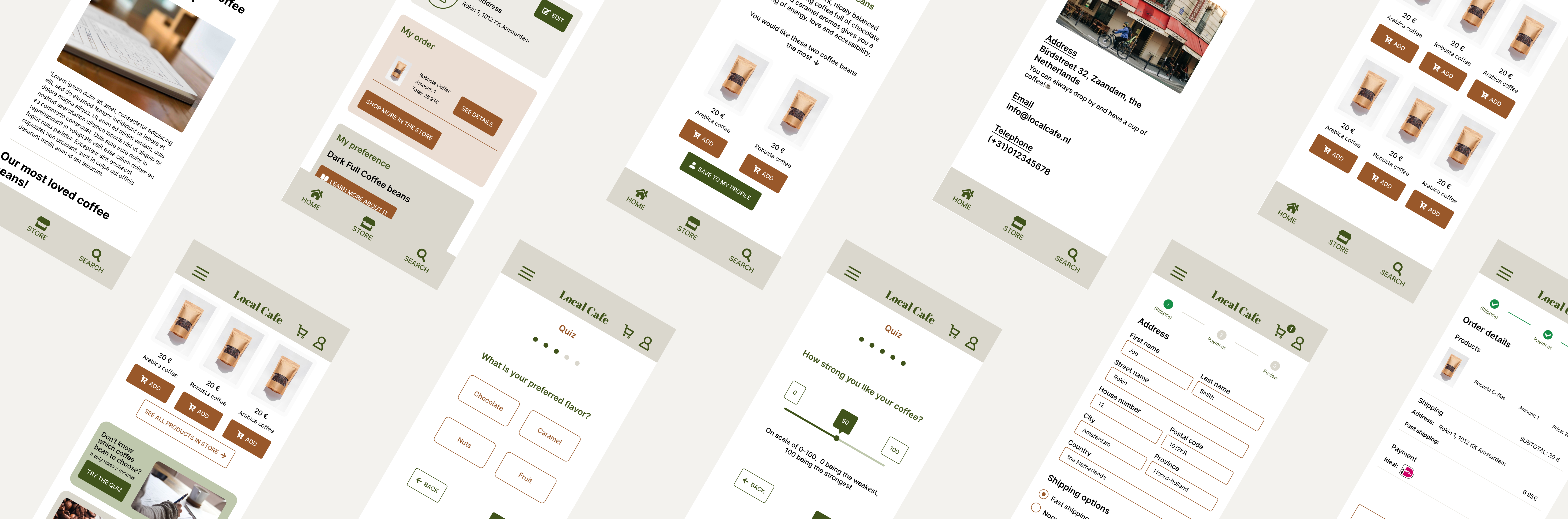
Finally, I presented them with this high-fidelity prototype to show how the whole flow would look like, with the help of the Quiz.
A high-fidelity prototype walk-through of using the Quiz
Present results
After we had done the second draft of the high-fidelity prototype, we still wanted to strive for a better user experience. We conducted a user interview with a usability study in it. It has been carried out with 6 participants.
- 100% of participants feel the Quiz section was a really new idea, and all of them felt it was a simple task to finish the Quiz.
- 83% of participants found the Quiz was helpful in identifying their coffee flavor preferences. And they were having high expectation and higher confident in finding their preferred coffee beans after finishing the Quiz.
- 67% of participants had expressed excitement that they would like to actually try out coffee beans to “verify” or “challenge”😄 the Quiz result.
Overall, it had been a good experience for users to use this webshop. The Quiz section had become users’ most interested part of this webshop app. It had definitely given them confidence in choosing coffee beans.
Next steps
- Integrate the Quiz result into shopping flow, in the format of filter, for example.
- Refine questions in the Quiz. We would like to invite some coffee bean experts to give advices on what good questions to ask in order to be able to identify key features of one's coffee flavor preference.
- Refine the high-fidelity prototype’s visual elements.